Cherry Blooms Package Design
Step by step how the process was done
The Challenge
Graphic Design
Print
When Cherry Blooms hero product was widely accepted in the beauty world, Cherry Blooms felt that it was the right time to upgrade the design to cater to the worldwide audience.
Cherry Blooms expanded to more products after successfully expanded worldwide with its Fiber Lash.
I was given the task to create their new products following the look and feel from the Fiber Lash product.
The Idea
Exciting & Rebellious
While the main designs were not created by me, I had the responsibility to make adjustments accordingly to the requirements of Cherry Blooms team.
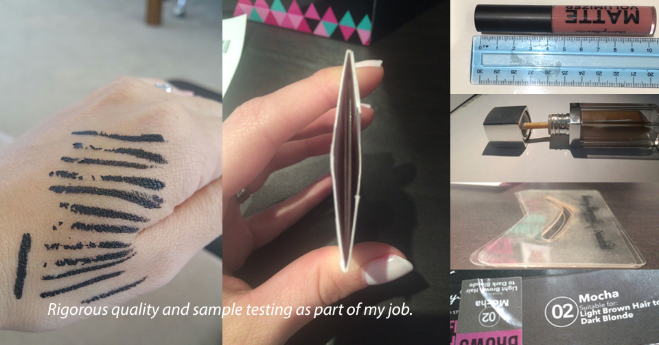
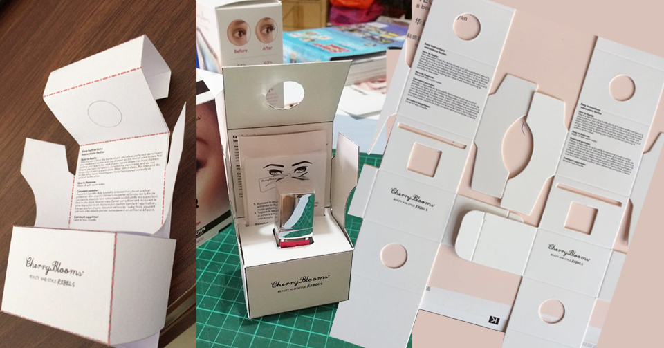
All artwork has to be calculated precisely to make sure the product fits into the box.
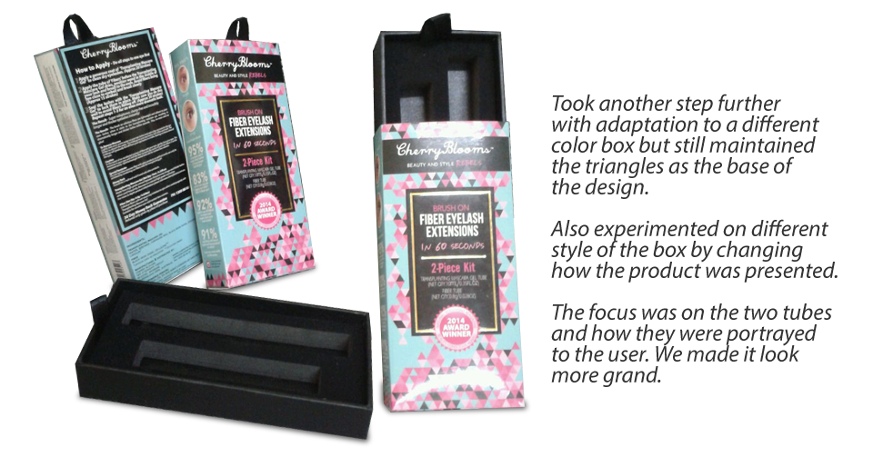
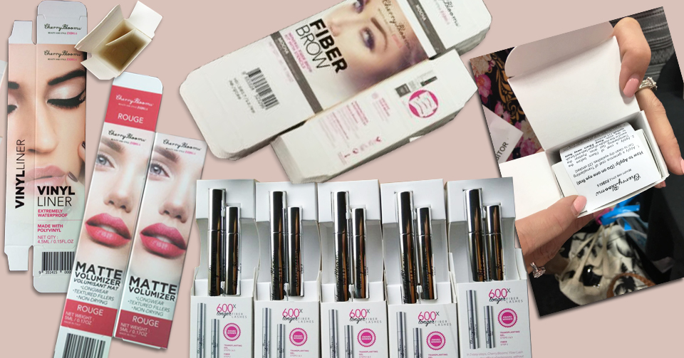
While the new products with components are of different sizes, my idea is to adapt the designs to the different box dimensions, based on the components of each product.
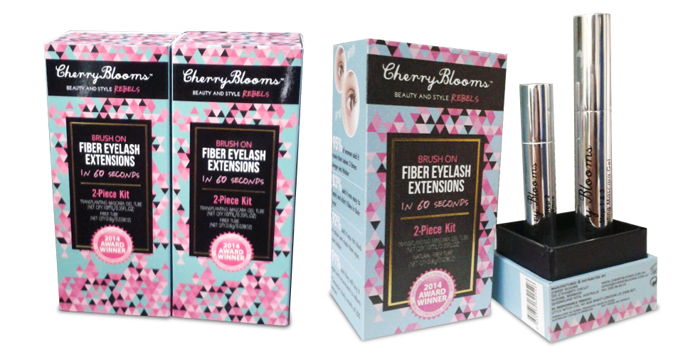
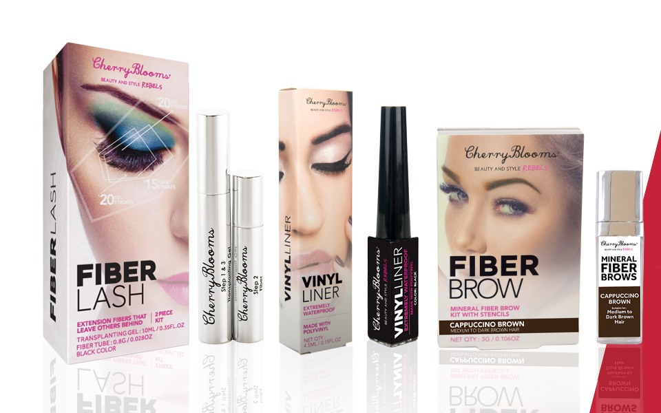
This is the latest look for Fiber Lash packaging.
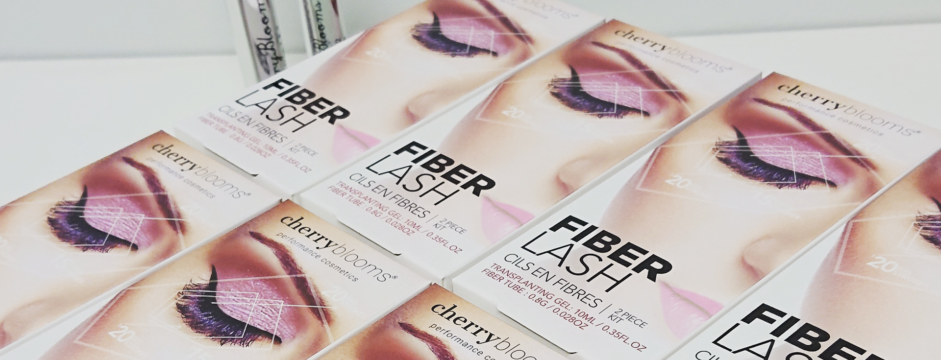
while each product has different components and box sizes, I adapted the basic design from the fiber lash box and incorporated it into the other products.
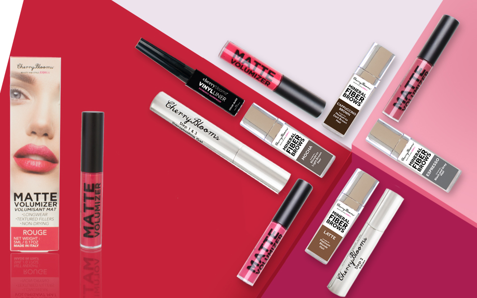
Below, you can see the evolvement of all the products.


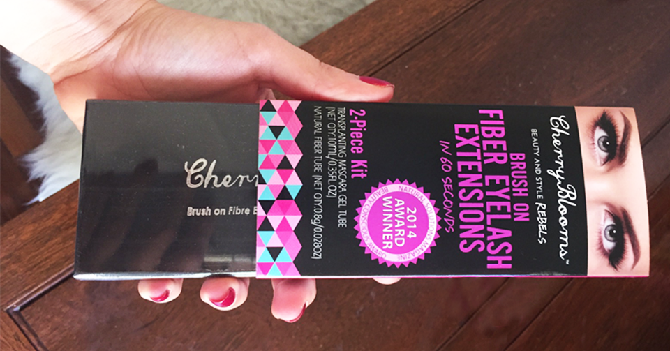
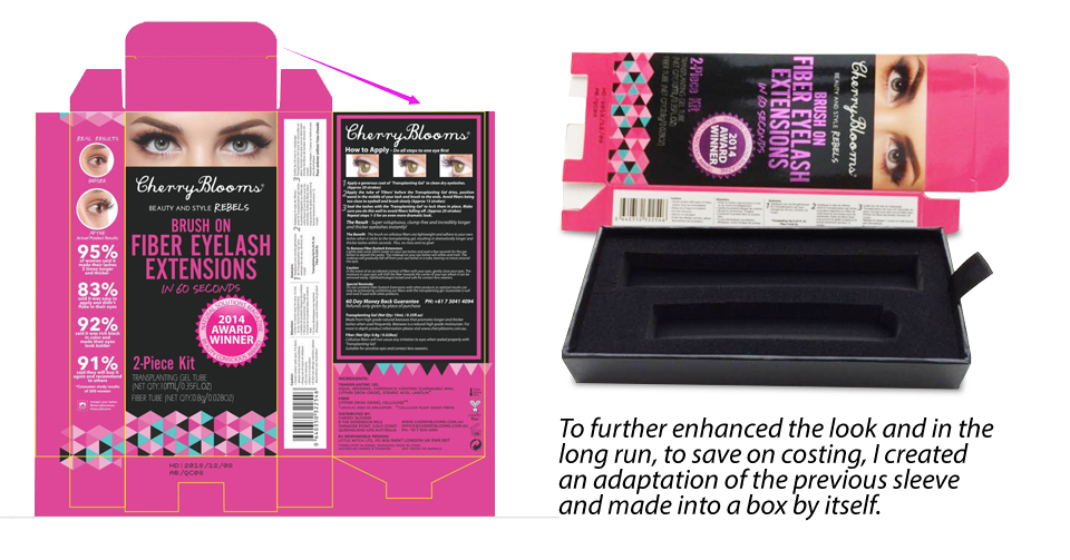
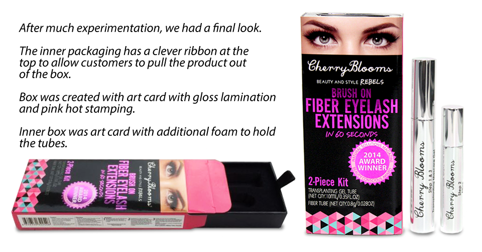
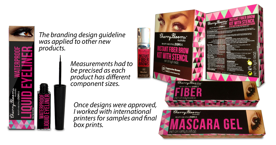
to improve the brand further, new branding guidelines were created and improved to show a more sophisticated beauty brand in the market. i worked with an international agency at USA and the result is as below. I then applied the new brand guideline to all the products.
The Result
long journey
This was an 8-year journey (till today) on the adaptation look and feel for cosmetic packaging.
These took time and resources, and many quality designs that were changed to make it look better.
